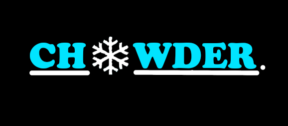
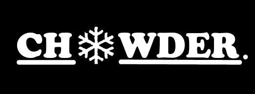
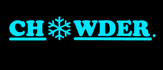
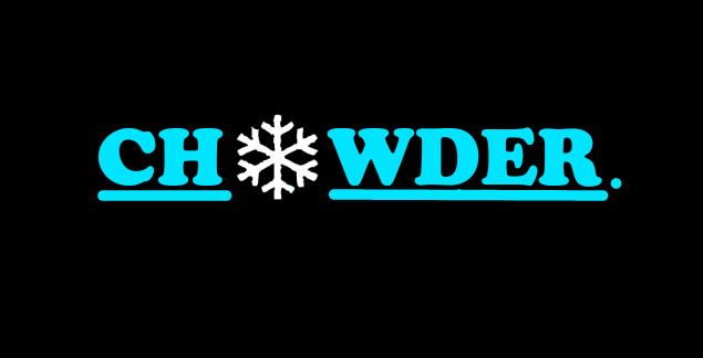
For this logo project, I created a logo that we are going to use for the Chowder inc company we are making. It is based of Chowing the Powder when skiing, so we incorporated colors that made it look like winter. Even the snowflake for the "o" helps to distinguish it. I went through many steps and someo fmy logos didn't even look like the ones above, but ones I zoned into the idea of the ones above, I changed the colors of every element to see what I liked most. I decided to go with the top one as it looks the best with the different colors.
